Draw a line graph
from scipy.stats import norm
import matplotlib.pyplot as plt
import numpy as np

x = np.arange(-3, 3, 0.001)

plt.plot(x, norm.pdf(x))
plt.show()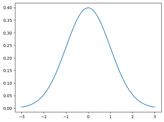
Multiple Plots on One Graph
plt.plot(x, norm.pdf(x))
plt.plot(x, norm.pdf(x, 1.0, 0.5))
plt.show()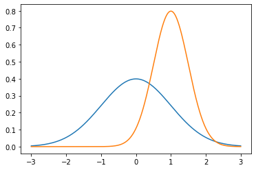
Save it to a File
plt.plot(x, norm.pdf(x))
plt.plot(x, norm.pdf(x, 1.0, 0.5))
plt.savefig('MyPlot.png', format='png')
Adjust the Axes
axes = plt.axes()
axes.set_xlim([-5, 5])
axes.set_ylim([0, 1.0])
axes.set_xticks([-5, -4, -3, -2, -1, 0, 1, 2, 3, 4, 5])
axes.set_yticks([0, 0.1, 0.2, 0.3, 0.4, 0.5, 0.6, 0.7, 0.8, 0.9, 1.0])
plt.plot(x, norm.pdf(x))
plt.plot(x, norm.pdf(x, 1.0, 0.5))
plt.show()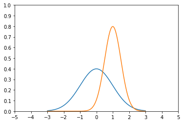
Add a Grid
axes = plt.axes()
axes.set_xlim([-5, 5])
axes.set_ylim([0, 1.0])
axes.set_xticks([-5, -4, -3, -2, -1, 0, 1, 2, 3, 4, 5])
axes.set_yticks([0, 0.1, 0.2, 0.3, 0.4, 0.5, 0.6, 0.7, 0.8, 0.9, 1.0])
axes.grid()

plt.plot(x, norm.pdf(x))
plt.plot(x, norm.pdf(x, 1.0, 0.5))
plt.show()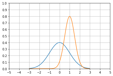
Change Line Types and Colors
axes = plt.axes()
axes.set_xlim([-5, 5])
axes.set_ylim([0, 1.0])
axes.set_xticks([-5, -4, -3, -2, -1, 0, 1, 2, 3, 4, 5])
axes.set_yticks([0, 0.1, 0.2, 0.3, 0.4, 0.5, 0.6, 0.7, 0.8, 0.9, 1.0])
axes.grid()

plt.plot(x, norm.pdf(x), 'b-')
plt.plot(x, norm.pdf(x, 1.0, 0.5), 'r:')
plt.show()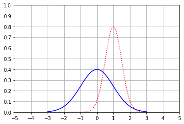
Labeling Axes and Adding a Legend
axes = plt.axes()
axes.set_xlim([-5, 5])
axes.set_ylim([0, 1.0])
axes.set_xticks([-5, -4, -3, -2, -1, 0, 1, 2, 3, 4, 5])
axes.set_yticks([0, 0.1, 0.2, 0.3, 0.4, 0.5, 0.6, 0.7, 0.8, 0.9, 1.0])
axes.grid()

plt.xlabel('Greebles')
plt.ylabel('Probability')
plt.plot(x, norm.pdf(x), 'b-')
plt.plot(x, norm.pdf(x, 1.0, 0.5), 'r:')
plt.legend(['Sneetches', 'Gacks'], loc=4)
plt.show()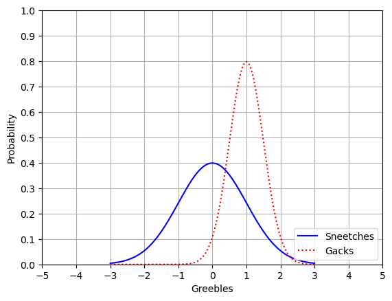
XKCD Style 🙂
plt.xkcd()

fig = plt.figure()
ax = fig.add_subplot(1, 1, 1)
ax.spines['right'].set_color('none')
ax.spines['top'].set_color('none')
plt.xticks([])
plt.yticks([])
ax.set_ylim([-30, 10])

data = np.ones(100)
data[70:] -= np.arange(30)

plt.annotate(
    'THE DAY I REALIZED\nI COULD COOK BACON\nWHENEVER I WANTED',
    xy=(70, 1), arrowprops=dict(arrowstyle='->'), xytext=(15, -10)
)

plt.plot(data)

plt.xlabel('time')
plt.ylabel('my overall health')
Pie Chart
# remove XKCD mode:
plt.rcdefaults()

values = [12, 55, 4, 32, 14]
colors = ['r', 'g', 'b', 'c', 'm']
explode = [0, 0, 0.2, 0, 0]
labels = ['India', 'United States', 'Russia', 'China', 'Europe']
plt.pie(values, colors=colors, labels=labels, explode=explode)
plt.title('Student Locations')
plt.show()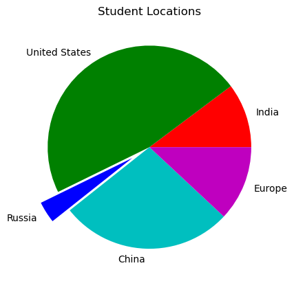
Bar Chart
values = [12, 55, 4, 32, 14]
colors = ['r', 'g', 'b', 'c', 'm']
plt.bar(range(0,5), values, color=colors)
plt.show()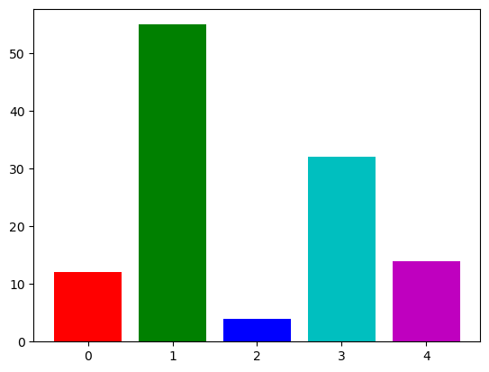
Scatter Plot
from numpy.random import randn

X = randn(500)
Y = randn(500)
plt.scatter(X, Y)
plt.show()
Histogram
incomes = np.random.normal(27000, 15000, 10000)
plt.hist(incomes, 50)
plt.show()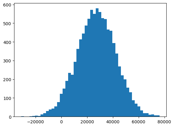
Box & Whisker Plot
uniformSkewed = np.random.rand(100) * 100 - 40
high_outliers = np.random.rand(10) * 50 + 100
low_outliers = np.random.rand(10) * -50 - 100
data = np.concatenate((uniformSkewed, high_outliers, low_outliers))
plt.boxplot(data)
plt.show()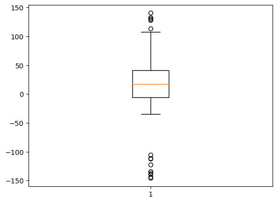
The following two tabs change content below.


Latest posts by mahisaajy (see all)
- Running Job MPI di LiCO HPC BMKG (Step-by-Step) - February 26, 2026
- Panduan Instalasi FortiClient VPN di Linux (Mint/Ubuntu) - February 25, 2026
- Instalasi SAC (Seismic Analysis Code) di MAC untuk Analisis Seismik - December 5, 2024


